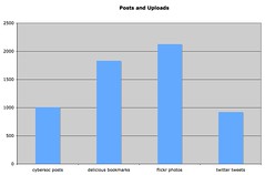
I’ve recently been thinking about where I participate the most online. The graph here shows my participation, measured in terms of content shared or posts, on three of the main services I use and this blog.
I thought this might be particularly revealing but realised, as soon as I’d created the graph, and another showing number of friends/contacts on ten social networking services, that there are many ways to measure participation – time spent, content created or shared, importance of participation, personal preferences, etc.
Mathemagenic recently shared a graph that plots her online activities against her work and family commitments. I really like this approach because it allows you to visualise priorities.
Yesterday I used a new twitter polling service to ask my twitter followers which service they checked first in the morning. Exactly half (13/26) respondents said email, followed by 29% (7/26) saying twitter. Phone and RSS each got one vote and no one claimed to check a social networking service first. Again, I wonder what this demonstrates about our participation online.
Where do you participate most online? What meaningful metrics have you devised for measuring your participation? Is it useful to understand where and how much you are using different services to create and share content or communicate?
