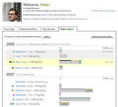
Perhaps I’m not the first to spot this, but dopplr, a social networking service that allows users to store and share their trips, has added a carbon footprint calculator (here’s mine).
The flaw in this is that it most people are unlikely to input their daily commute and other small journeys that people frequently take but tend not to view as interesting enough to post on dopplr.
Also, the service dopplr uses to make the calculations appears to assume that all journeys are made by plane rather than forms of transportation with lower carbon emissions. But, for the global jet-set at least, it is a useful way of seeing at a glance the impact of longer flights and other journeys.

Check out this US Carbon Footprint Map, an interactive United States Carbon Footprint Map, illustrating Greenest States. This site has all sorts of stats on individual State energy consumptions, demographics and State energy offices.
http://www.eredux.com/states/
When you add a trip now you get an option to tell Dopplr whether you are on a plane, train or automobile.