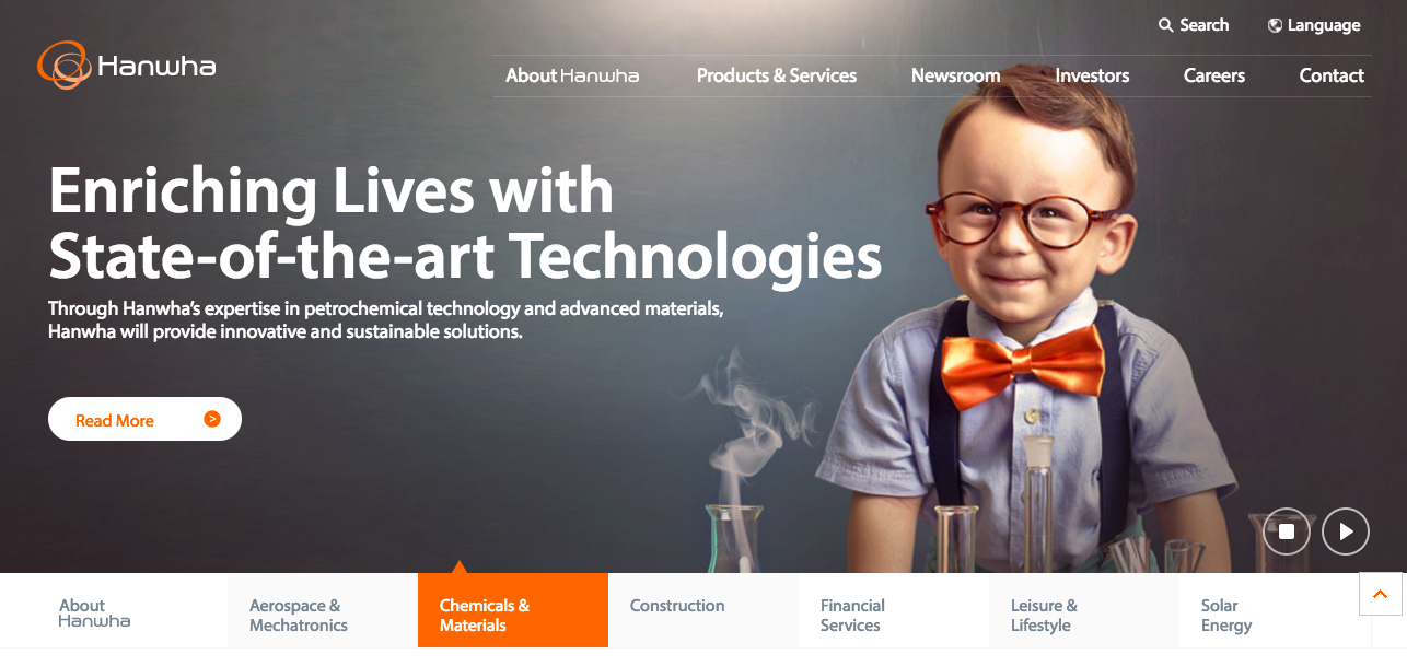
In 2013, I was approached by a leading Korean conglomerate, with businesses in a variety of sectors including chemicals, manufacturing, leisure, finance and pharmaceutical. Their previous website had been cobbled together over a number of years and made use of technologies, such as flash, which were detrimental to it’s usability and findability.
We worked with the project sponsors to understand the stakeholder landscape both within and beyond the business itself. Through competitor benchmarking, research of the digital and social media landscape within the brand’s target markets, and a series of interviews and workshops with internal stakeholders and a handful of clients, we were able to quickly define a new approach to digital for the brand.
Several new website designs, following the UX which we defined, were presented for consideration. Ultimately, we landed upon an elegant, reductive design that allowed the brand to tell it’s most important stories in new ways. We were also commissioned to produce all of the website’s content and to culturally adapt it into six additional languages including Chinese and Japanese.
We also supported the brand in a CMS selection process, ultimately guiding them to the procurement of Adobe CQ5, then emerging from competitor to leader status in Gartner’s Magic Quandrant.
We implemented the templates in CQ, populated it with content authored by our team, and went live…
You can see the results at http://www.hanwha.com
